
Mazarrón FB Rebranding
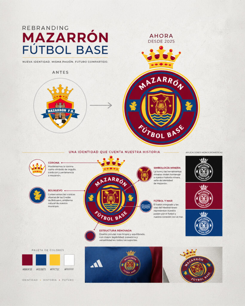
Rebranding and visual identity for Mazarrón Fútbol Base, redesigning its crest to create a more modern, strong, and recognizable image without losing the essence and symbols tied to its history.
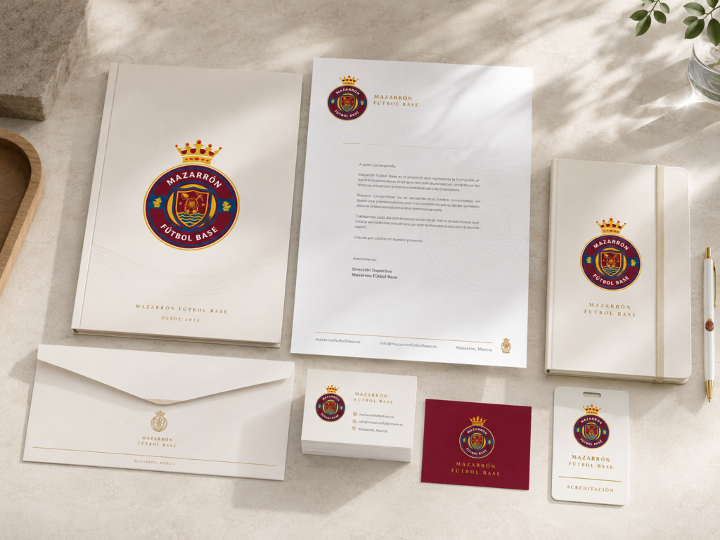
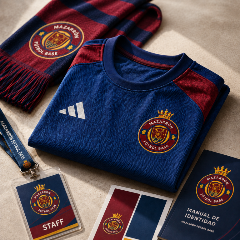
A new visual identity that connects soccer, the region, and tradition, designed to be consistently applied across all of the club's platforms.
The Project
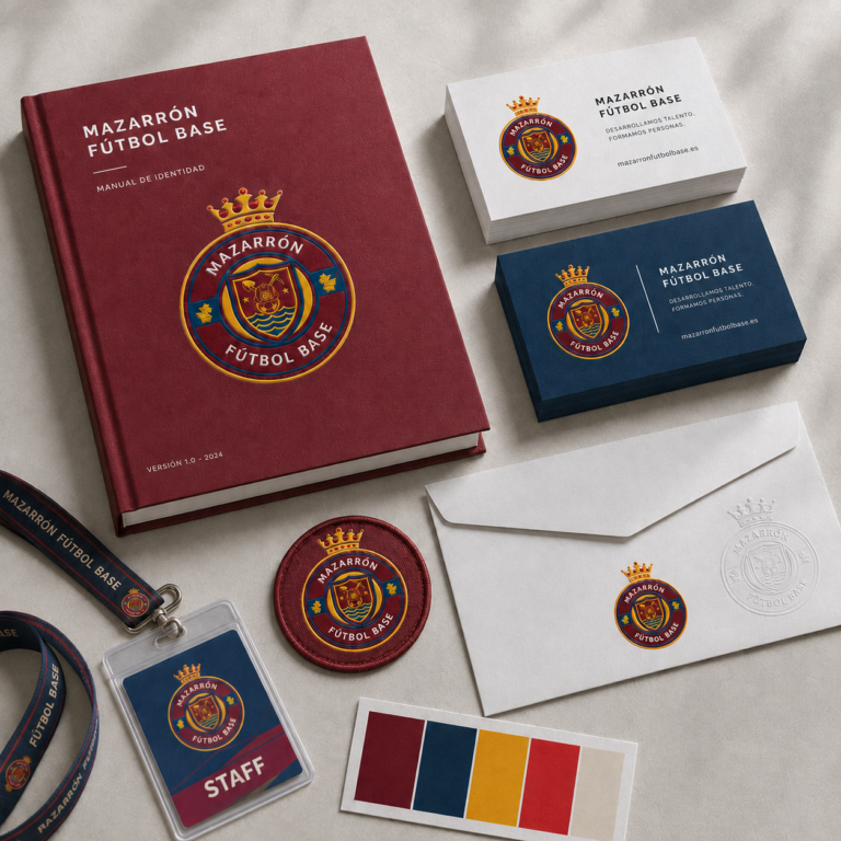
We redesigned the Mazarrón Fútbol Base brand identity, drawing on elements from the club’s history to create a cleaner, more balanced, and more versatile crest capable of representing the club both on and off the field.
The new identity retains symbols associated with the municipality—such as the crown, the distinctive landforms of Bolnuevo, the mining tradition, and Mazarrón’s connection to the sea—integrating them into a more contemporary circular structure with greater visual impact.
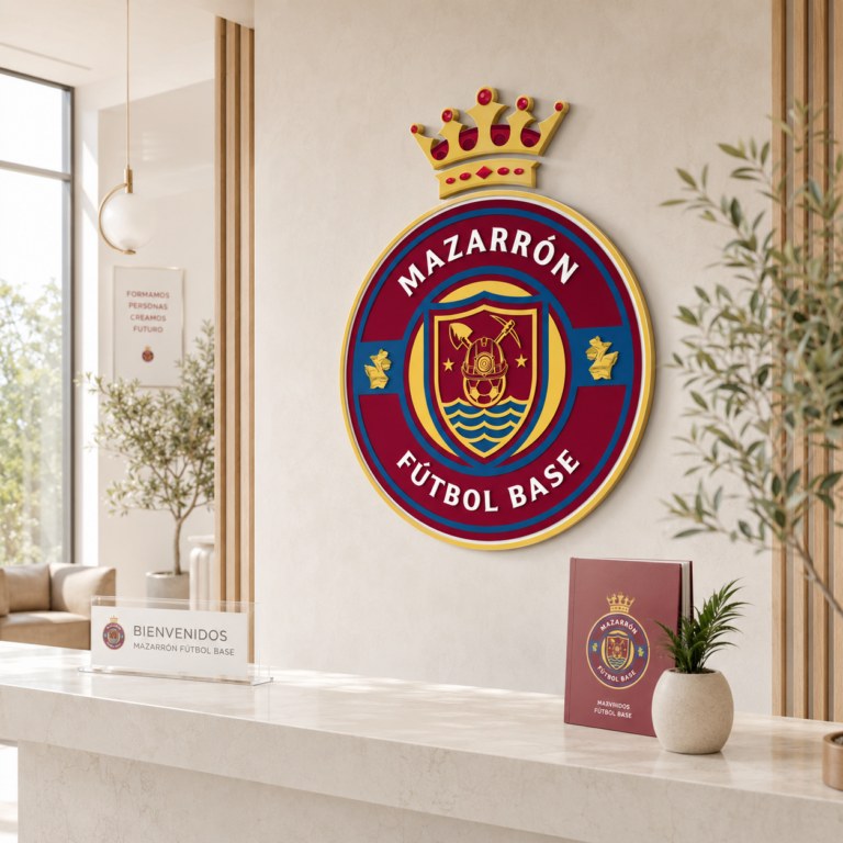
The result is a graphic system with a color palette based on maroon, blue, and yellow, designed to work in both color and monochrome versions and to adapt precisely to uniforms, stationery, signage, digital media, and merchandise.
Do you have a project in mind?
Let's talk
Tell us your idea, and we'll help you make it a reality.
Contact Us →